FHK Henrion: graphics as propaganda in World War II
 First published in Blueprint, December 1986 - January 1987
 He represented the progressive mission of twentieth-century graphic design
In the 1940s FHK Henrion did some of the world’s most passionate posters; in the 1960s, he helped create the face of post-war Britain
‘In 1942 and 1943 we were just looking to survive. I went by bike to work 15 hours a day at the Ministry of Information, in the London University site in Malet Street. In the afternoon I’d be picked up by a Packard and go over to the US Office of War Information, Grosvenor Square. There, graphic designers at the rank of colonel put together magazines for the American armed forces.
‘Before D-Day we made anti-German posters. After D-Day they were used in Holland, Belgium and France: the Allies got the German PoWs they took to stick them over the posters the Nazi forces of the Occupation had put up. After D-Day I worked with a team of 15 designers making eight posters a fortnight. Multilingual posters with pictograms. My influences were Otto Neurath, John Heartfield and Herbert Bayer’.
To talk to Henrion is to confront the history of twentieth century graphics. The history is a British one yet it begins, as does so often post-war British design, on the continent. Born in Nuremberg, 1914, of a French mother and German father, Henrion moved to Paris in 1933 – the year Hitler came to power. In Paris he trained with Paul Colin, with Cassandre and with Jean Carlu, the three giants of pre-war French graphics. He became Colin’s assistant; but then, in 1936, gave in his notice to join Cassandre. At just that point, one weekend in June, the sit-down strikes waged by the Parisian metalworkers against France’s first few days of Socialist government created, Henrion says, a situation of ‘civil war’. He had left Colin but could not join Cassandre.
So Henrion left France for the Levant, where he designed posters for the French pavilion at the Levant Fair in Tel Aviv. Immediately he met more civil war – this time between Arab and Jew in the British mandate of Palestine. Henrion had to get out again. Luckily, though, his work was then spotted by the Crown Agents, and, still in 1936, they brought him to us in Britain to design posters boasting the merits of citrus fruit.
In London Henrion took a flat with Walter Landor. He worked with MARS, the Modern Architectural Research Group, picked up some typography as he went along, and was almost outraged to discover that you could get £100 for a bit of type, provided only that it was applied to packaging.
Henrion’s first love, however, remained posters. They were ‘the most glamorous, most artistic’ medium to work in as a designer. ‘You could sign a poster’.
Politics and caricatures
Henrion became a member of Artists’ International, an anti-fascist association of designers sympathetic to the Communist Party. Inspired by the caricatures of George Grosz, he rubbed shoulders with James Boswell, James Fitton and James Holland; also, with Misha Black, in those days a committed Marxist. ‘I wasn’t thinking of joining the Communist Party’, Henrion says, matter-of-factly. ‘Politically, I was a late developer’
When the Second World War began, Henrion found himself interned with Otto Neurath, the brilliant originator of Isotype pictograms. Set free, he worked for the Brits, the Americans, and the Dutch government in exile. Here Henrion did posters that, to my mind, make him one of the twentieth century’s most brilliant wartime graphic designers – the propaganda equal, in many respects, of Alexander Rodchenko and El Lissitsky in the turbulent years of 1917-21.
As Heartfield had borrowed montage from Rodchenko, so in turn Henrion borrowed from Heartfield. He hand-coloured photographs and, in his beautiful and surreal ‘It’s a dream – it’s Harella’ ads for the brush-wool coats of the Utility period, mounted these hand-coloured photographs on to engravings. His sensational poster for Mrs Stafford Cripps’ aid-to-Chiang-Kai-Shek fund was based on a montaged photograph of a London Chinese waiter: ‘The most contrived human models’, he jokes, ‘were always the best’.
To see Henrion’s wartime work is to be conscious of a structure of political alliances very different to that obtaining today. The wife of Cripps, previously a left-wing firebrand, organised money for Chiang-Kai-Shek, who in 1927 had drowned the Chinese revolution in blood and so postponed it more than 30 years. The wife of Churchill, the notorious anti-Bolshevik of the 1920s, organised an Aid to Russia Fund with Henrion’s help: he used as the basis of his montaged poster a summer 1941 issue of Pravda. Henrion’s most striking poster, however, is about international alliances. Against a sunburst yellow background, a black swastika is pulled apart, fragmenting into four sections pulled by hands painted with Stars-and-Stripes, Union Jacks, Tricolours and Hammer-and-Sickles.
Those juxtaposed flags showed even then how much Henrion had appropriated the basic language of what was to become known as ‘corporate identity’ in the 1960s. Unlike quite a number of his contemporaries, Henrion realised in the 1950s that posters had, in the wake of television and press advertising, moved from being a leading promotional medium to a supportive one. He therefore dropped posters and proceeded to ‘work for fewer clients, with more control’, in corporate identity. KLM’s logo was one of his first jobs. Thereafter, he did some of Britain’s most familiar housestyles: Blue Circle cement, BEA, London Electricity Board, Giro, Wates, Tate & Lyle, and Coopers & Lybrand. Together with a collaborator, Ian Dennis, he also designed the National Theatre logo.
The new face of Britain
More, perhaps, than any other graphic designer, Henrion helped create the face of post-war Britain. His posters for Tony Benn in Labour’s election campaign of 1964 – ‘Fair rents, cheaper mortgages – YES, it’s part of Labour’s plan’ and a ‘More teachers, smaller classes’ one with the same punch-line – are redolent of the Wilsonian era.
Henrion’s bookcases are, unlike those of many designers, ample and full. He unfurls automatically a slide projection screen in his home studio. His talk on trompe l’oeil and his essay ‘I Eye, sir’ in the Design Council anthology Royal designers on design are both intriguing; he is an accomplished lecturer at art schools and international design conferences; he has done distinguished exhibitions, sculptures, jewellery and product design; his contemporary posters and design work are still powerful. But somehow it is still that high-pressure early 1940s output – the wartime propaganda posters – that fascinates the most.
Mid-century modern
A difference between then and now is that America was widely celebrated. When, in 1942, Roosevelt entered the war proclaiming that man should be free of want and fear, free to worship and say what he liked, Henrion designed a hugely successful exhibition for Artists International to uphold FDR’s Four Freedoms. Held in an air raid shelter underneath a bombed-out John Lewis, Oxford Street, it featured Sutherlandish ruins spray-painted by artists-turned-firemen. There were 12 paintings by Oskar Kokoschka, Augustus John and others; C Day Lewis captions which made up a rhyming poem, and an opening ceremony performed by Brendan Bracken. But this Atlanticism – like Henrion’s wartime cover for Harpers, illustrating Lend Lease with a benevolent American hand dispensing tanks and planes – would probably not find such a sympathetic audience today.
Compared with all too many late 20th-century designers, however, mid-century Henrion was specially adept at juxtaposing slogans, captions and general copy against images. He read the words and understood them. He was also keen on pictograms. His posters for the Ministry of Agriculture included a succession of hand-coloured photomontages and pictograms urging those digging for victory to get into pigs, allotments and rabbits, which were ‘off the ration’. Pictograms were later the basis of Henrion’s impossibly complex diagram explaining the National Health Service to a sceptical British Medical Association.
There is much to be learnt from Henrion’s work, and there is still a history to be written of him, Penguin’s Hans Schmoller, Czech and Polish graphic designers like Walter Trier and George Him, and of wartime graphics greats such as Fougasse, the Radio Times and The Listener. Today Henrion is worried about Maggie’s likely victory in the General Election, ambivalent about West Germany’s technological superiority over Britain, concerned that posters (he mentions Silk Cut) are ‘too clever’, too television-based: ‘The era of the heroic poster’, he says, ‘is over’. He is ‘not sure’ about Neville Brody and feels that West Coast post-modern graphics is all very well, but that it is ‘invites to weddings, to shows – no message’. Nevertheless Henrion thinks that graphics jobs in print, and art school graduates to do them, can only grow. Standards, he says, are higher than ever – but there is, he argues, not much innovation in evidence.
Henrion is not nostalgic about the past. A Royal Designer for Industry and an Officer of the British Empire, he has come a long way in the 50 years since Leon Blum’s Popular Front government; but his critique of current graphic design is a fair, not a conservative one. He is somebody to be admired, emulated, but not idolised. He represents the progressive mission of twentieth-century graphic design.
Fmr President of Kenya on Trump cutting off foreign aid:
“Why are you crying? It’s not your government, he has no reason to give you anything. This is a wakeup call to say what are we going to do to help ourselves?”
America first is good for the world.
Our entire Green Socialist establishment should be banged up under the ‘Online Safety’ laws, for spreading demonstrable lies (the ‘climate crisis’), causing non-trivial harm to the industrial working class, ordinary drivers, farmers, taxpayers etc, etc.
#Chagos? #Mauritius PM Navin Ramgoolam "is reported to want Starmer to pay £800m a year, plus ‘billions of pounds in #reparations’." (14 January) https://www.spiked-online.com/2025/01/14/the-chagos-islands-deal-is-an-embarrassment/
Now the Torygraph wakes up https://telegraph.co.uk/gift/1ff8abbb462cd609
Read @spikedonline - first with the news!
Articles grouped by Tag
Bookmarks
Innovators I like

Robert Furchgott – discovered that nitric oxide transmits signals within the human body

Barry Marshall – showed that the bacterium Helicobacter pylori is the cause of most peptic ulcers, reversing decades of medical doctrine holding that ulcers were caused by stress, spicy foods, and too much acid

N Joseph Woodland – co-inventor of the barcode

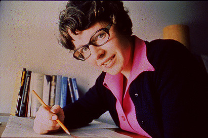
Jocelyn Bell Burnell – she discovered the first radio pulsars

John Tyndall – the man who worked out why the sky was blue

Rosalind Franklin co-discovered the structure of DNA, with Crick and Watson

Rosalyn Sussman Yallow – development of radioimmunoassay (RIA), a method of quantifying minute amounts of biological substances in the body

Jonas Salk – discovery and development of the first successful polio vaccine

John Waterlow – discovered that lack of body potassium causes altitude sickness. First experiment: on himself

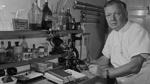
Werner Forssmann – the first man to insert a catheter into a human heart: his own

Bruce Bayer – scientist with Kodak whose invention of a colour filter array enabled digital imaging sensors to capture colour

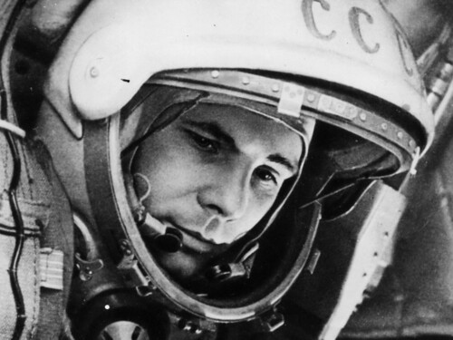
Yuri Gagarin – first man in space. My piece of fandom: http://www.spiked-online.com/newsite/article/10421

Sir Godfrey Hounsfield – inventor, with Robert Ledley, of the CAT scanner

Martin Cooper – inventor of the mobile phone

George Devol – 'father of robotics’ who helped to revolutionise carmaking

Thomas Tuohy – Windscale manager who doused the flames of the 1957 fire

Eugene Polley – TV remote controls


0 comments