David King: graphic designer, ranged left
 First published in Blueprint, November 1984
When once he art-edited the Sunday Times colour supp, David King revived Leon Trotsky
Then he designed the Anti-Nazi League and helped to launch City Limits. He’s just re-styled Crafts magazine, and his latest book – on Stalin’s terror – is published this month. This was King’s first-ever major interview.
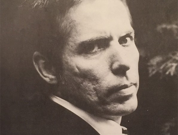
Photograph: Donald McCullin
You could sum up David King as Trotskyist typographer, but he’d object. Trotsky, he points out, said the term ‘Trotskyism’ was an invention of Stalin. In reality, Leon Davidovitch Bronstein’s politics were just Marxism, Marxism fiercely hostile to what the Kremlin had become. King is equally hostile – ‘it’s obvious why’, he says – but he dislikes labels. He is a great admirer of Trotsky’s ideas and of his life (‘extraordinary’), but he can do without the adjective. Especially given the way Fleet Street tabloids use it.
Nor is he, he adds, a typographer. For an unlikely but now famous Central Institute of Adult Education poster, he invented a special typeface, all spikey bold condensed caps; but though it now adorns Crafts and the jacket of his new book, he has failed, as yet, to give it a name. Likewise, his covers for the first 47 issues of City Limits were often distinguished by their use of pure typography as against photographs or illustrations; but King insists that his work is about visual history and visual politics, not letterform. Between 1965 and 1975 he worked with art director Michael Rand on the Sunday Times Magazine. There he not only did typography, but travelled widely and took a lot of pictures too. Above all, though, he discovered.
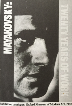 King owns photographs that undo, in a single shot, all the re-writing of history for which Uncle Joe became notorious. He has not just the one in which the steps up to the podium occupied by Lenin are filled with an expectant but later-to-be-retouched-out Trotsky. No: he has a narrow pose of Lenin in front of Maxim Gorky, and the original from which it was taken – complete with Bukharin, Zinoviev, the German communist leader Karl Radek and the Indian communist M N Roy. All edited out by the GPU. Indeed, so thoroughgoing has been the Stalinist demolition of the photographic form that the false images put together in the 1930s are now themselves almost impossible to find. Khrushchev and his successors made sure of this… in the name of deStalinisation, of course.
It has been King’s achievement to cut through all that. Unshaven, in bumpers and a red chequered Levi’s shirt, full of stutters, exhausted from a game of tennis and with four deadlines to make, he betrays a searing commitment to The Truth. A flat in North London, yes, but ‘I’m not Tariq Ali’. Nor Private Eye’s Dave Spart: his hesitancy is that of diffidence, not blather, and, though he has no need to impress, Albinoni and Schubert are at the front of his record stack. So why has he bothered to slave away, as he puts it, finding all that archival material? When he began, at least, he cannot have guessed that it would do more to rehabilitate Stalin’s most eloquent critic than a hundred far-left demos. Again: why, apart from what has become known as the David King Collection, is he famous for slotting his photographic finds into a Constructivist graphic format – one that, without his efforts, might never have stirred again since its destruction after 1929?
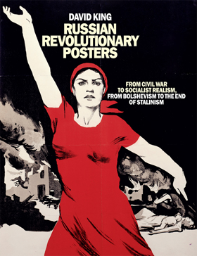 ‘I’m obviously obsessed with Soviet politics, but it all started with the need to disseminate information visually. There’ve been thousands of words written on the Soviet Union – E H Carr alone wrote 13 volumes on the subject. I wanted to visualise the words. In the 1960s everybody used to go on about Modernist design, the Bauhaus. I used to fret that the Bauhaus wasn’t everything. I felt that the revolutionary explosion of graphics that had followed 1917 had been suppressed, both East and West – that it needed to be brought to light.
King doesn’t mention Socialist Realism: one suspects he might choke on the phrase. On the other hand, he bridles at the suggestion that his approach is simply Constructivist. No pigeonholing. Anyway, for all his fondness of reds and blacks and sans serif, the ism is far from accurate. King’s use of montage recalls Heartfield, while Blood and Laughter, the book of anti-Tsarist caricatures he has collected (commentary by Cathy Porter; Cape, 1983), reveals a love of illustration. As to his graphics being derivative, we’ll come to that.
Past accidents
King is 41. It’s hard to believe he has a 20-year-old son (doing film) and a 19-year-old daughter (doing theatre). He did painting at school, then trained in typographic design at the London School of Printing, Clerkenwell Green, under the legendary Tom Eckersley and the artist Rolf Brandt. Though he remains critical of Bauhaus worshippers, he’s grateful for having the basics of that school drilled into him: ‘Detailing is neglected these days. It’s wrong’. But his strength in typography, like so many aspects of his life, came about by accident. ‘The teachers were brilliant, but the choice of typographic design, not graphics, was made simply because someone told me Eckersley’s department was better. One day I looked up from my drawing board and for an awful moment, considered the possibility that I was only doing typography because I’d wandered into the wrong room’.
Life was very different then. ‘Nothing was designed in those days – you trained in design, then went on to work for a printer. I didn’t want to do letterheads. Never. Then a teacher called Keith Cunningham put me on to magazines and Eisenstein, whose ideas at that time few appreciated’. There followed a spell laying out for Illustrated Newspapers, and more than a year with Tom Wolsey, ‘The great – almost the only – art director of the day’. Then, in 1965, Rand recruited him to the Sunday Times Magazine. He was 22.
The move was important. Whereas the London School (now College) of Printing was, King says, ‘all form’, the journalism of the Sunday Times Magazine was ‘all content’. Through it, he did a book on Mohammed Ali. ‘We weren’t full of gardening and cooking like it became after 1975 – all consumery. We did lots of sport, lots of crime, lots of politics’. After five years full‑time, King decided to work for the magazine freelance, partly so he could do more books. (‘Books have no ads! I hate ads. They’re like Moscow in reverse’.) Yet, not only in books but also in his magazine work, the early 1970s was the period when King’s name most clearly caught the public eye.
From 1967 on King had slowly started collecting Soviet photographs and building up the network of international contacts upon which he continues to rely for sources. His uncle had been a socialist, and he had been a socialist when a student, but it was his presentation of what are still politely known as ‘troublespots’ that made all the difference. He notes how quickly people have forgotten what the Sunday Times Magazine was like then – ‘You should do a feature on those old issues’, he interjects. Bitterly, he dredges up a feature on Biafra shot by Donald McCullin: it ran to no fewer than 23 pages. The captions proclaimed – and, in the phrase of the day, you know it makes sense – that Biafran records of baby deaths officially logged thousands of them as the product of Harold Wilson Syndrome.
King’s hatred of the pipe-smoking Labour leader burns in him even new. He adds: ‘Today the magazines are all the same. Then, too, they were bigger and less right-wing. Layouts only went by a formula because printing schedules were very complex, but then the formulas were exciting. There was a willingness to use young people’.
King laid out McCullin spreads on Biafra, McCullin spreads on Vietnam. He blamed British and American governments for the scenes depicted, and still talks of their hypocrisy now. But it was not until 1970 that his involvement with the USSR began in earnest. He went to Moscow for three weeks to do picture research for the Lenin centenary, and, on his return, was given 24 pages over two issues to celebrate it. On his visit, he learnt that Trotsky did not exist in the Soviet Union. By accident once more, therefore – ‘my interest has never been academic’ – he began 18 months of fresh research, right down to photographs kept in manila envelopes by aged American Trotskyists and by Mexicans who had known the Old Man in the final years before his assassination. The result was a cover story for the Sunday Times Magazine, ‘Trotsky: the Conscience of the Revolution’. Published on 19 September 1971, it ran to 16 colour pages.
In the issue King was given formal credit for his detective work. In terms of mass culture, he had done more even than Trotsky’s distinguished Polish biographer, Isaac Deutscher, to popularise the man who had been leader of the Petrograd Soviet at 26 and commander of the Red Army at 38. The A4 Penguin on Trotsky King brought out with Francis Wyndham that same year sold an astonishing 25,000 copies. A follow-up published in French (words by Pierre Broué) appeared in 1979, and a new, English-language version is due shortly. But by 1975 King had left the Sunday Times and magazine journalism for good. Now he concentrated on political posters, and his graphic technique and philosophy matured.
Hows and whys: saving money, gaining speed
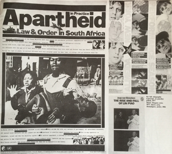 Like the Bolsheviks, the left-wing organisations for which King made posters had little money. The designer thus set out to squeeze the last drop of graphic value from his posters. Instead of expensive duo-toning, he would double-print, slapping black on red ‘dot for dot’, assuming the two colours would fall out of register, hoping for – and getting – three-dimensional effects as a result. Bizarre posters for a United Nations pressure group opposed to trade in nuclear materials with South Africa exemplify his approach. They are the colour of South African blacks and, to stress the nuclear side, come complete with tiny equations reversed out into the big black caps: e = mc2, Apartheid = Racism + Exploitation.
‘All content’ once again. ‘In general writers aren’t visual, photographers are away on a shoot and editors are out to lunch’, says King, but the problem with designers is that they can’t read’. He insists that they should. At the same time they must know ‘how to becaught in the middle, squashed between editorial, which is always – understandably – late, and printers, who have fixed production slots’. Apart, then, from its money-saving aspects, King’s work is distinguished by the speed with which he completes. He never does roughs, only finished artwork: if clients don’t like it, that’s too bad. ‘No time, no time’, he says intently. He uses a setsquare rarely, preferring to buy A1 graph paper, turn it upside down on the front of a light box and compose direct (‘There’s a place to go to on Tottenham Court Road that sells paper with quarter-inch squares rather than millimetres. It’s a nice big size’).
 King is never paid for his posters. Plenty of rich stars backed the Anti-Nazi League, but it didn’t have to part with money – even though King more than anybody else was responsible for identifying (naively equating?) the National Front with Hitler’s bands in the public mind (he used another equation, elided-NF = swastika, and inserted the adjective ‘Nazi’ in the slogan ‘Stop the National Front’ with an arrow which was at once carrot, targetting device and finger of guilt). No pay, no pay, ‘but the best work is always the work you do for free. See what readers make of that when you print it!’.
Well: is his work derivative? ‘Everything’s derivative, so it’s a question of what it’s derivative of. Now, I’m a political designer: I’m interested in design, but only up to a point. (By the way, I’m also interested in art. Most designers are against it, but there’s not much difference between art and design.) In the West, most of those origins are bourgeois – they’re to do with selling magazines, stylishness. I was interested in alternatives. So if my design is derivative of the Russian Revolution, that of others is derivative of bourgeois forms’.
King recounts a conversation he recently had with an illustration student at St Martin’s School of Art, where he does some part-time teaching. He liked her work; other members of staff didn’t. ‘I told her: if you have critics, ask them what their work’s like, and who they’re working for’. At the same time he is contemptuous of radical posturing in graphics. He thinks the design of the Labour Party’s New Socialist and the Communist Party’s Marxism Today is lousy. ‘People think that two sheets of Franklin Gothic and some heavy rules is enough to do successful left-wing graphics. It isn’t’.
The present as history
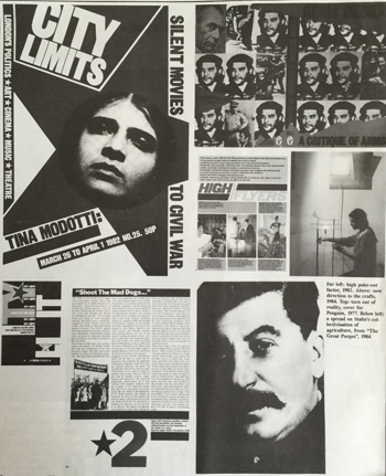 Nearly three years ago, King, the ANL behind him, helped put City Limits on the road to its current circulation of 21,000 (Time Out, the more moderate weekly from which it split, has 66,500 buyers). He lent a hand on the inside of the book, ‘but you can’t lay down a style for others to follow’. His real contribution was in the startling duality of the covers, not just in the type-only ones, but also in photographic items: ‘I decided that four-colour half-tones didn’t show up on newsstands, so I began to turn the four-colour press to new ways of handling black-and-while pictures’. The outcome was negatives of sweaty saxophonists, reversed out as a cyan dot-for-dot overprint on magenta. They looked just like saxophonists look under 2am jazz club spotlights, and certainly stood out when displayed on street corners; but the markups for the printers were, King grins, almost an article in themselves.
At the time he was diversifying. In 1980 he ventured into true 3-D work with his design for an Arts Council exhibition on Lubetkin: it travelled round Europe, and confirmed King’s growing interest in wood, sculpture and carpentry (he confides that he makes chairs). Blood and Laughter? ‘Another accident. I was in a Russian emigré bookshop in Queens in New York. It was full of boring anti-Soviet books like I Chose Freedom. Then, underneath a pile, I found a stack of 1915 magazines in terrible condition. Some years later exactly the same thing happened again in another New York bookshop. I thought the illustration was much more exciting than, say, Simplicissimus. I like it when pages are yellow and dogged, too. They reproduce better’.
His new book is titled The Great Purges (Basil Blackwell, 1984). It has a short introduction by Isaac Deutscher’s widow, Tamara, and a history of the Purge as a political phenomenon; typically scholarly, this consists of a series of previously unpublished documentary radio plays broadcast by Deutscher in the early 1960s (the book is published on 8 November by, price £12.50). Purges is, in my view, a triumphant return to form, all cinematic close-ups and long-shots, words integrated with pictures in a piece of ergonomics many of Britain’s better-respected graphic designers could learn a lot from. Already The Stalin Myth, a kind of Purges 2, is on its way.
How, given these gargantuan projects, did King handle a job as different as redesigning the Crafts Council’s Crafts? The answer is as professional and as political as one would expect. ‘The editor, Tina Margetts, gave me a call. I felt the old style was too timid, but I didn’t want it to look like a political magazine. What was obvious was that the crafts needed a more directional and more international feel to them – as an occupation, they’re atomised, and were until recently in a rather bad way. The magazine, too, needed the same feel. They couldn’t afford a dummy, so I went straight out and did a whole issue. Also I represented a change in the means of production for then. Laying out direct, they could move from nine to sixteen pages of four-colour, and add sixteen pages of two-colour too’. Since King took over, Margetts observes, the magazine has started to sell out in all sorts of places it never used to. It’s an irony that King’s work pays so clearly.
Opposed to Stalinism, ready to work for Crafts, King’s political affiliations remain loose: he is a member of no organization, admits to ‘bourgeois tendencies’ when it comes to selling papers outside factories at 6am, and insists that ‘you don’t have be on the winning side in politics – it’s something that grows’. Yet he’s still passionate, and, unlike many of his contemporaries, appears proud not to be in the Labour Party. His is also a lonely position – not only politically, but also in terms of his fondness for particular graphic gambits. ‘I’m probably the most hated designer Britain. At least it feels that way sometimes’. Nevertheless, graphic designers without self-respect still ring him up to ask whether he would mind if they imitated his work. ‘I don’t get cross’, he says, ‘just sad’.
To download a PDF copy of this article click on this Ranged left link.
Fmr President of Kenya on Trump cutting off foreign aid:
“Why are you crying? It’s not your government, he has no reason to give you anything. This is a wakeup call to say what are we going to do to help ourselves?”
America first is good for the world.
Our entire Green Socialist establishment should be banged up under the ‘Online Safety’ laws, for spreading demonstrable lies (the ‘climate crisis’), causing non-trivial harm to the industrial working class, ordinary drivers, farmers, taxpayers etc, etc.
#Chagos? #Mauritius PM Navin Ramgoolam "is reported to want Starmer to pay £800m a year, plus ‘billions of pounds in #reparations’." (14 January) https://www.spiked-online.com/2025/01/14/the-chagos-islands-deal-is-an-embarrassment/
Now the Torygraph wakes up https://telegraph.co.uk/gift/1ff8abbb462cd609
Read @spikedonline - first with the news!
Articles grouped by Tag
Bookmarks
Innovators I like

Robert Furchgott – discovered that nitric oxide transmits signals within the human body

Barry Marshall – showed that the bacterium Helicobacter pylori is the cause of most peptic ulcers, reversing decades of medical doctrine holding that ulcers were caused by stress, spicy foods, and too much acid

N Joseph Woodland – co-inventor of the barcode
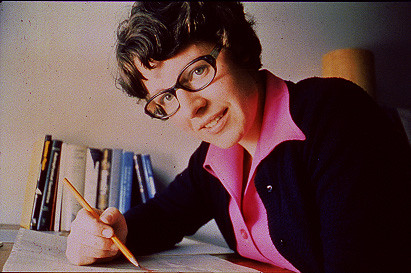
Jocelyn Bell Burnell – she discovered the first radio pulsars

John Tyndall – the man who worked out why the sky was blue

Rosalind Franklin co-discovered the structure of DNA, with Crick and Watson

Rosalyn Sussman Yallow – development of radioimmunoassay (RIA), a method of quantifying minute amounts of biological substances in the body

Jonas Salk – discovery and development of the first successful polio vaccine

John Waterlow – discovered that lack of body potassium causes altitude sickness. First experiment: on himself
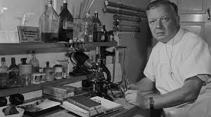
Werner Forssmann – the first man to insert a catheter into a human heart: his own

Bruce Bayer – scientist with Kodak whose invention of a colour filter array enabled digital imaging sensors to capture colour
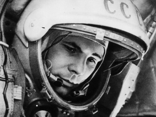
Yuri Gagarin – first man in space. My piece of fandom: http://www.spiked-online.com/newsite/article/10421

Sir Godfrey Hounsfield – inventor, with Robert Ledley, of the CAT scanner

Martin Cooper – inventor of the mobile phone

George Devol – 'father of robotics’ who helped to revolutionise carmaking

Thomas Tuohy – Windscale manager who doused the flames of the 1957 fire

Eugene Polley – TV remote controls


0 comments