Colour, brands and identity in tomorrow’s cities
In London, they brought the fluid neon colours back. For more than 50 years, the moving, illuminated electronic liquid of Lucozade, an energy drink, inspired motorists driving above down-at-heel Brentford, as they reached the western approaches of Britain’s capital at night
Then, in 2004, the local council demanded that the ageing red bottle endlessly pouring golden goodness into a glass be demolished, despite local protests. But in 2010 the product’s makers, GlaxoSmithKline, built a new and exact replica of the original sign and mounted it just 200 meters away. (1)
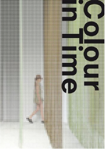
Here is the first section of a Chapter in a book edited by Jan Brand and Anne van der Zwaag – click on this How colour will likely change the urban landscape link to read the full chapter.
How corporate and product colours will infiltrate public space even more
With Lucozade the brand, the sign and its colours were a widely loved urban monument. And whatever the intensity problems with the new, dear, long-life but low-energy light emitting diodes (LEDs) that are coming into general interior use, we can be sure that, over the next 10 years, the exteriors of the world’s big buildings will brightly shine brands in gigantic colours, with moving lights, in amazing new ways. One does not need to term these works kinetic sculptures, as some do. The point is simple: developments in architectural engineering, height and form, when melded with progress in displays, will conspire to make facades into cinemas for the colourful brand.
In Pudong, Shanghai’s financial district, the vertical corners of buildings already boast blue lights that run up and down 70 stories or more, making edifices fairly throb with energy at night. Already, too, one whole side of a skyscraper plays videoclips over the Huangpu River. So it will not be long before such large-scale tricks make corporate colours into urban icons all over the world. In 1970, following a visit to Tokyo four years earlier, France’s Roland Barthes published his personal interpretation of Japan: Empire of Signs. Forty years later, the electronic urban logo is a large, dynamic spectacle and emphatic corporate or product identifier that’s coming to your city wherever you are. What’s more, its colours will be more precise than ever.
How colours affect our recognition of and preference for certain brands
With Lucozade the red and yellow in the sign directly copy the colours of the product’s distinctive packaging. But there is something interesting about this mix of colours. Red and yellow were for decades the colours of two other, more universal urban landmarks – McDonald’s, and Shell.
As is suggested with Lucozade, red and yellow together can well connote things that are essential to travel in and between cities: fuel, energy. Figuratively, these are what McDonald’s provides, and Shell provides them literally.
Some maintain that McDonald’s may have benefited from the fact that red stimulates the adrenaline glands in the brain, or that red and yellow are the first two colours the eye processes and sends to the brain. Yet the similarity of the colours in Lucozade, McDonald’s and Shell suggests that colour in branding is more about repeatedly and consistently being distinctive – about standing out, especially in poorer, grittier, greyer districts such as Brentford – than it is about differentiation against other brands. Indeed, distinguished Australian academics, studying soft drinks brands in the UK and banking brands in Australia, have come to the same conclusion. (2)
The financial and colour clout wielded by large corporate brands may homogenise cities, as environmentalists often charge. (3) But we may also conclude that in complex urban settings, and perhaps especially in the Third World, endlessly familiar corporate colours reassure, suggest modernity and relative safety, work as geographical landmarks, and invite brand loyalty.
References
1. Ian Mason, ‘Lucozade to unveil its new neon sign by the M4 after six-year absence’, This is local London, 15 February 2010, on http://www.thisislocallondon.co.uk/whereilive/southwest/hounslow/5008320.Brentford_welcomes_back_giant_neon_sign/
2. Jenni Romaniuk, Byron Sharp and Andrew Ehrenberg, ‘Evidence concerning the importance of perceived brand differentiation’, Australasian Marketing Journal, 15 (2) 2007, on http://members.byronsharp.com/different.pdf
3. See for example Molly Conisbee et al, Clone town Britain: the loss of local identity on the nation’s high streets, New Economics Foundation (NEF), 28 August 2004, on www.neweconomics.org/gen/z_sys_PublicationDetail.aspx?PID=189. For an update, see Andrew Simms, Petra Kjell and Ruth Potts, Clone town Britain: the survey results on the bland state of the nation, 6 June 2005, NEF, on www.neweconomics.org/gen/z_sys_publicationdetail.aspx?pid=206
Fmr President of Kenya on Trump cutting off foreign aid:
“Why are you crying? It’s not your government, he has no reason to give you anything. This is a wakeup call to say what are we going to do to help ourselves?”
America first is good for the world.
Our entire Green Socialist establishment should be banged up under the ‘Online Safety’ laws, for spreading demonstrable lies (the ‘climate crisis’), causing non-trivial harm to the industrial working class, ordinary drivers, farmers, taxpayers etc, etc.
#Chagos? #Mauritius PM Navin Ramgoolam "is reported to want Starmer to pay £800m a year, plus ‘billions of pounds in #reparations’." (14 January) https://www.spiked-online.com/2025/01/14/the-chagos-islands-deal-is-an-embarrassment/
Now the Torygraph wakes up https://telegraph.co.uk/gift/1ff8abbb462cd609
Read @spikedonline - first with the news!
Articles grouped by Tag
Bookmarks
Innovators I like

Robert Furchgott – discovered that nitric oxide transmits signals within the human body

Barry Marshall – showed that the bacterium Helicobacter pylori is the cause of most peptic ulcers, reversing decades of medical doctrine holding that ulcers were caused by stress, spicy foods, and too much acid

N Joseph Woodland – co-inventor of the barcode
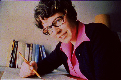
Jocelyn Bell Burnell – she discovered the first radio pulsars

John Tyndall – the man who worked out why the sky was blue

Rosalind Franklin co-discovered the structure of DNA, with Crick and Watson

Rosalyn Sussman Yallow – development of radioimmunoassay (RIA), a method of quantifying minute amounts of biological substances in the body

Jonas Salk – discovery and development of the first successful polio vaccine

John Waterlow – discovered that lack of body potassium causes altitude sickness. First experiment: on himself
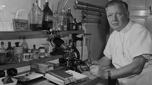
Werner Forssmann – the first man to insert a catheter into a human heart: his own

Bruce Bayer – scientist with Kodak whose invention of a colour filter array enabled digital imaging sensors to capture colour
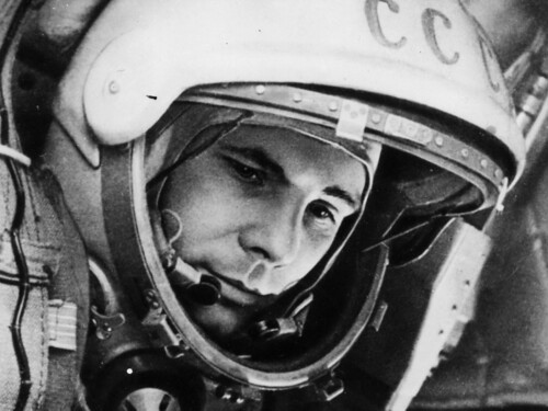
Yuri Gagarin – first man in space. My piece of fandom: http://www.spiked-online.com/newsite/article/10421

Sir Godfrey Hounsfield – inventor, with Robert Ledley, of the CAT scanner

Martin Cooper – inventor of the mobile phone

George Devol – 'father of robotics’ who helped to revolutionise carmaking

Thomas Tuohy – Windscale manager who doused the flames of the 1957 fire

Eugene Polley – TV remote controls


0 comments