Chequeless, cashless, clueless in the smart card society
 First published in Management Today, November 1990
The cashless and chequeless society is here. Yet the industry that has grown up around fund transfer terminals and cards is short on information about what users have let themselves in for.
Over the past year, investment by British retailers in computerised tills has risen by 40 per cent. Opening new stores isn’t such a clever idea nowadays; but, given labour shortages and the need to free staff up to pay greater attention to customers, it does make sense to raise the efficiency of existing stores by equipping them with new technology. Through barcode scanners and data processing, stock can be controlled more closely, while labour levels can be matched to demand and labour productivity monitored with precision. At the same time, data can be captured on customer preferences, the profitability of particular lines and the merits of different store layouts and shelf displays.
Moreover such electronic point of sale systems are now more and more being joined by the cashless, chequeless transfer of funds from the same ‘intelligent’ terminals. Have your card swiped, and the price of those vegetables or that petrol is automatically deducted from your account.
It all sounds so simple, doesn’t it? But from the user’s point of view the reality behind the clichés of plastic money and the cashless society can be bewildering. First, the two developments described above – EPOS and EFTPoS – form a preface to an avalanche of acronyms: SWITCH (Britain’s de facto electronic funds clearing system), PDQ4 (funds transfer terminals made by Fortronic and supplied by Barclaycard), PINs (Personal Identification Numbers) and so on. The enormous industry that has grown up around Britain’s 150,000 funds transfer terminals and its unequalled-in-Europe 100 million cards seems unable to explain itself.
Second, cardholders are often unaware that what backs their cheques, allows cash withdrawals at banks or functions as a credit card, storecard, charge card, budget card or charity card can in many instances also work as a funds-transferring debit card. Third, cards themselves, never a work of art, have turned into an information design disaster.
My Barclaycard, for example, has no fewer than nine different typefaces on it. True, the print on the back is constrained by the size of the rectangle; yet it could be bigger and thus more accessible to the old and/or shortsighted. There is the usual intimidating financial services English: paragraph two consists of a sentence 86 words long and has two mentions of the word ‘hereon’ in it. Finally, the machine-readable embossed letters and numbers on the front side have been specially arranged so that the print on the back is mangled. It is barely possible to learn that the value of the cheques I can write is limited to £50.
Barclaycards, however, are nothing special. Indeed other cards – MasterCard, Shakespeare, Link, Electron, Eurocard – err more thoroughly in another matter: the number of logotypes they bear.
There’s more. Most of the machines that swipe cards are not only indifferently designed themselves; they also seem to offer a maximum of noise for a minimum of print quality. Worse still, the more tricks they are capable of, the less they appear to tell the user what is going on. And this basic opacity of design is shared by another vital development of the 1990s – that of the ‘smart’ card.
The way things are going, shoppers who identify themselves through their cards will soon be given ‘frequent customer’ discounts to encourage retailer brand loyalty. But tracking them can go a lot further than that. ‘How did those curtains look?’, the solicitous sales person on the checkout might shortly demand of you, as his or her screen flashes up your last purchase and notes that matching wallpaper just happens to be the subject of a special promotion this week. Confectionery, reading matter, underwear: all our tastes may one day circulate around the checkout.
Nevertheless, the British in particular bridle at being the target of ‘target marketing’. Already, cards are a symbol of debt or of status; if the information they reveal is available only on one side of the till, they could in addition wind up denoting a surveillance of Orwellian proportions. In fact, however, the issue runs deeper and less melodramatically than this. There ought to be a way of making the experience of paying for something not just quicker for users, but more pleasurable too. They need a more active and probably more tactile experience on their final exit; and they certainly need more and better information about what they have just let themselves in for.
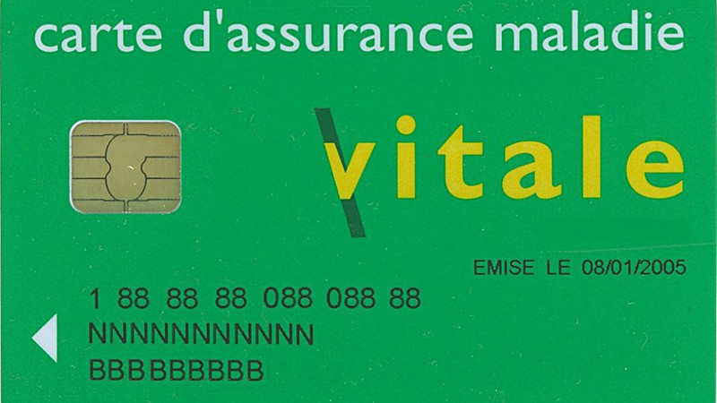
The latter point holds good for smart cards too. Whether as electronic purse, means of authorising payment or physical entry, store of personal medical history, or wad of tickets, smart cards have a great future at bank, gym and cinema alike. Fitted with adapters to amplify the radio signals they generate, they can do their business simply by being worn, rather than being swiped. But the chances are that those who use them, like those who use their cousin, the pocket computer, will be unaware of their full range of capabilities.
That won’t do. Of course, the compact personal cardreading machine, in variations designed for carefully segmented lifestyles, is already upon us. But I suspect that smart cards, perhaps the most Delphic product of information technology yet, could benefit simply from some fine information design — both on the plastic, and on the manuals that go with them.
Fmr President of Kenya on Trump cutting off foreign aid:
“Why are you crying? It’s not your government, he has no reason to give you anything. This is a wakeup call to say what are we going to do to help ourselves?”
America first is good for the world.
Our entire Green Socialist establishment should be banged up under the ‘Online Safety’ laws, for spreading demonstrable lies (the ‘climate crisis’), causing non-trivial harm to the industrial working class, ordinary drivers, farmers, taxpayers etc, etc.
#Chagos? #Mauritius PM Navin Ramgoolam "is reported to want Starmer to pay £800m a year, plus ‘billions of pounds in #reparations’." (14 January) https://www.spiked-online.com/2025/01/14/the-chagos-islands-deal-is-an-embarrassment/
Now the Torygraph wakes up https://telegraph.co.uk/gift/1ff8abbb462cd609
Read @spikedonline - first with the news!
Articles grouped by Tag
Bookmarks
Innovators I like

Robert Furchgott – discovered that nitric oxide transmits signals within the human body

Barry Marshall – showed that the bacterium Helicobacter pylori is the cause of most peptic ulcers, reversing decades of medical doctrine holding that ulcers were caused by stress, spicy foods, and too much acid

N Joseph Woodland – co-inventor of the barcode

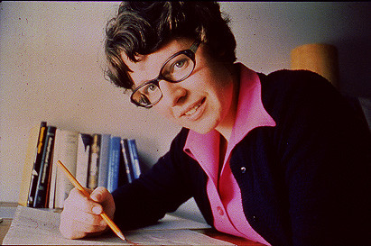
Jocelyn Bell Burnell – she discovered the first radio pulsars

John Tyndall – the man who worked out why the sky was blue

Rosalind Franklin co-discovered the structure of DNA, with Crick and Watson

Rosalyn Sussman Yallow – development of radioimmunoassay (RIA), a method of quantifying minute amounts of biological substances in the body

Jonas Salk – discovery and development of the first successful polio vaccine

John Waterlow – discovered that lack of body potassium causes altitude sickness. First experiment: on himself

Werner Forssmann – the first man to insert a catheter into a human heart: his own

Bruce Bayer – scientist with Kodak whose invention of a colour filter array enabled digital imaging sensors to capture colour

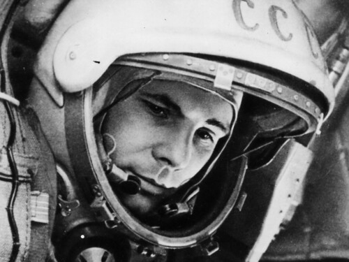
Yuri Gagarin – first man in space. My piece of fandom: http://www.spiked-online.com/newsite/article/10421

Sir Godfrey Hounsfield – inventor, with Robert Ledley, of the CAT scanner

Martin Cooper – inventor of the mobile phone

George Devol – 'father of robotics’ who helped to revolutionise carmaking

Thomas Tuohy – Windscale manager who doused the flames of the 1957 fire

Eugene Polley – TV remote controls


0 comments